3.4 Use white space and avoid clutter.
Clean, uncluttered webpages are easier to read24,30—they’re less distracting and less overwhelming for everyone, especially people with limited literacy skills and very busy users.
Use white space in your content to break information into chunks. Leave space between sections of text and around images and buttons.
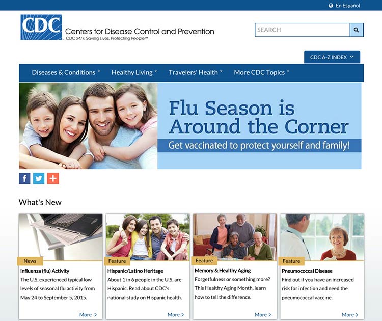
The CDC.gov homepage includes space around the logo and search box, and under the banner image, which helps the site look clean and uncluttered.

Source: https://www.cdc.gov/ homepage
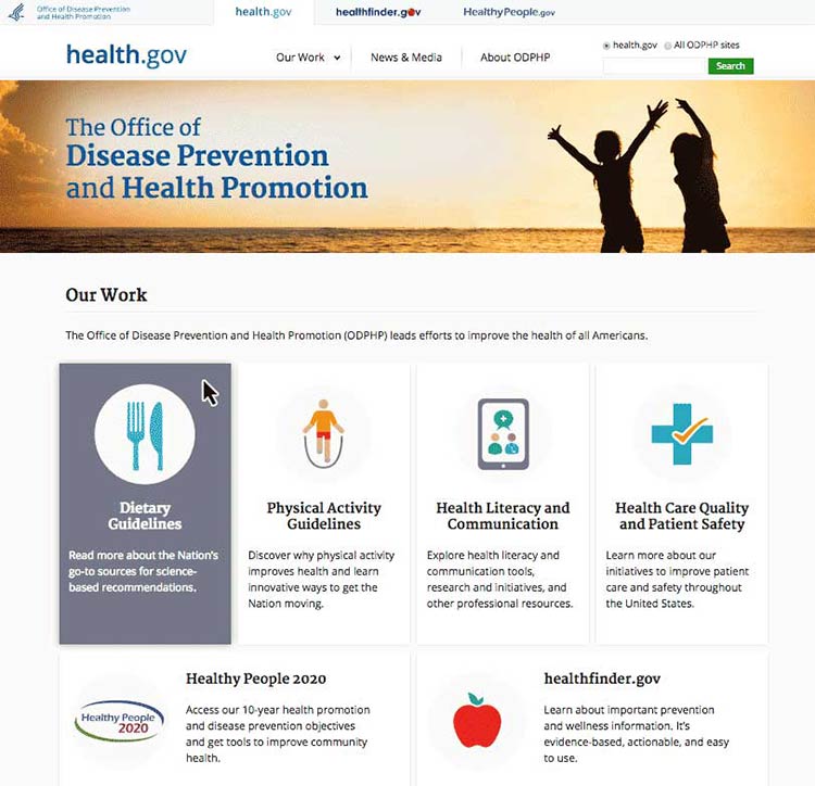
The health.gov homepage also has a very clean look with lots of white space.

Source: http://www.health.gov
White space around site features also helps mobile users interact with buttons and links without accidentally tapping the wrong place.