3.8 Use images that help people learn.
Including simple visuals to support written text can help users with limited literacy skills find, understand, communicate, and use health information.30,38,65,68,69
Choose images that support your text.
Think of graphics as a way to enhance and explain your content, not as decorations. Also look out for visuals that might actually diminish your content—busy, bright, or animated graphics are distracting and often mistaken for advertisements.41
Choose realistic images.
Use realistic pictures to illustrate health behaviors and clarify medical concepts. Users prefer photographs of “real” people rather than illustrations or people who look like models.49 It’s also important to show people of diverse racial and ethnic backgrounds. That way, more people will be able to find “themselves” on your site—and more easily relate to your content.
Keep in mind that people react strongly to images, so be sure to test your site with images included. Pay attention to users’ reactions to the images—they may surprise you.
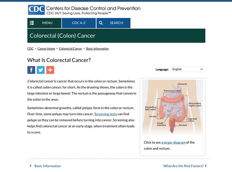
When illustrating an anatomical or medical concept, consider a simple line drawing—they’re often most effective.67
This simple line drawing and labels from CDC.gov explain the location of the colon and rectum.

Source: https://www.cdc.gov/cancer/colorectal/basic_info/what-is-colorectal-cancer.htm
Make sure the meaning of your image is clear to all users.
Always include a descriptive caption that explains the picture.67 Use alternative text (called an “alt tag” or “alt text”) to describe graphics for people using screen readers.