4.4 Give buttons meaningful labels.
Include buttons or links with labels that tell users where they will go. Web users will click through if you give them reason to believe the click will lead them toward their goal.81
Skip page numbers or generic labels, like “Next” or “Back.”81 Instead, use specific labels, like “What is cholesterol?” or “Back to the homepage.”
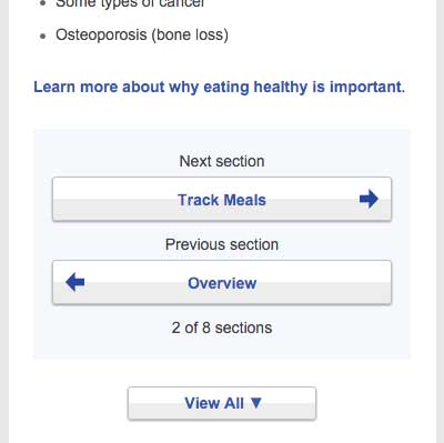
In a study of healthfinder.gov mobile usability, users missed the clickable page numbers. Instead of page numbers, healthfinder now uses buttons with more meaningful labels.

Source: https://health.gov/myhealthfinder/topics/health-conditions/diabetes/eat-healthy