4.9 Include a simple search function.
Web users with limited literacy skills are more likely to use a search function that’s simple and user-friendly.
Make your search function easy to locate and use.
Use a large text box with obvious buttons.15
Use a “get started” or “go” button next to your search box.
During usability testing conducted by ODPHP, some users with limited literacy skills clicked a “search” button without entering any terms in the search box.49 A clearly labeled button will signal users that they need to enter a term(s) first.
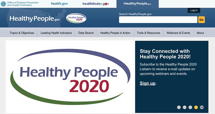
The Healthy People website has a large search box and prompts users to submit their search request with a “go” button.

Source: http://www.healthypeople.gov
Allow for common misspellings.8,30
Spelling is difficult for limited-literacy users,3,10,15 so make sure your search engine will still work if users make a spelling mistake. Help users search by providing spelling and autocomplete assistance.3,10,15
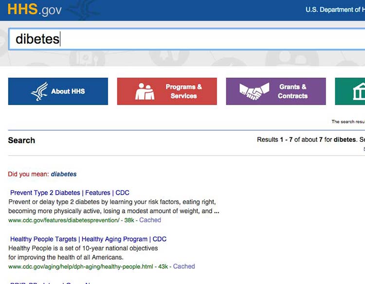
HHS.gov uses autocomplete to help users with spelling, and if a search term is misspelled, the results recommend a word using “Did you mean...”

Source: HHS search results for diabetes